Visual Rebrand for Two Church Communities
Challenge
I was approached by two churches—one in Arizona and one on the East Coast—to refresh their digital presence and better connect with their distinct young adult audiences. Both churches wanted to strengthen engagement on social media, but their demographics and visual expectations were very different. The Tucson church had a strong millennial presence, including a college ministry and podcast, while the East Coast church had a larger population of young professionals with a preference for a more subdued, authentic aesthetic.
Approach
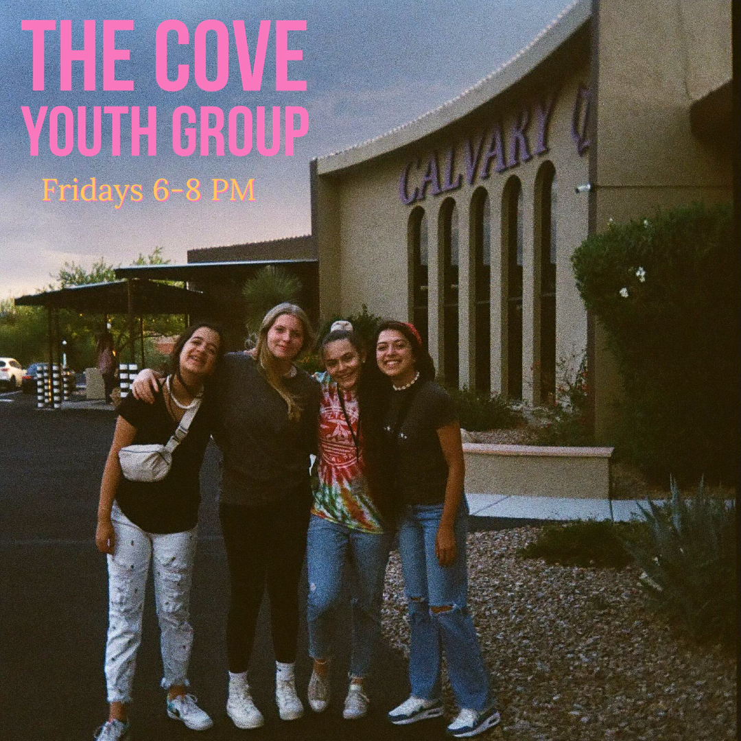
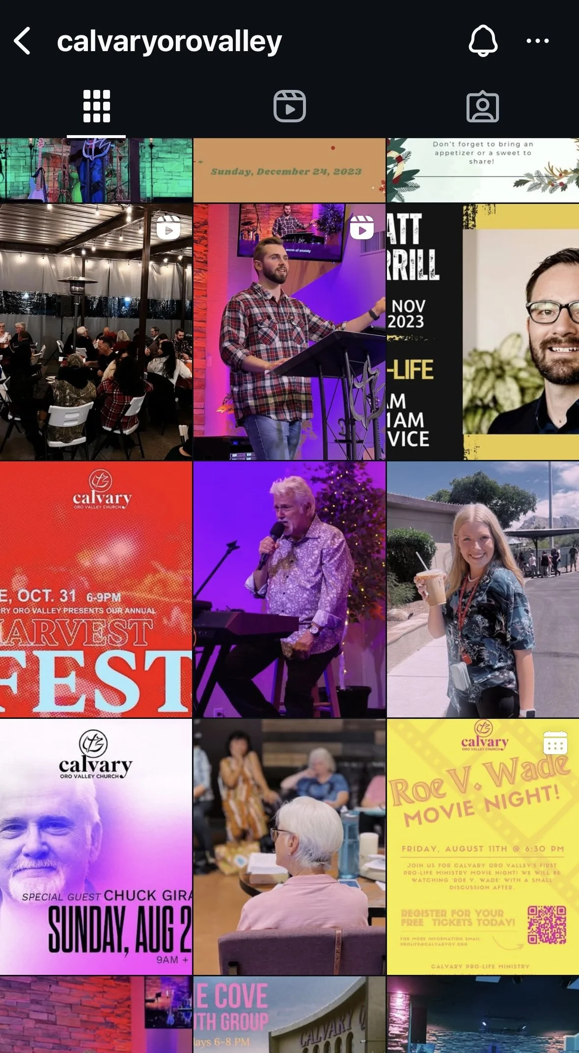
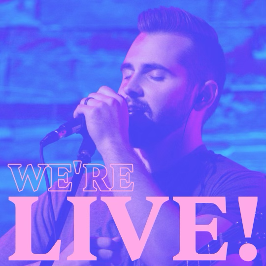
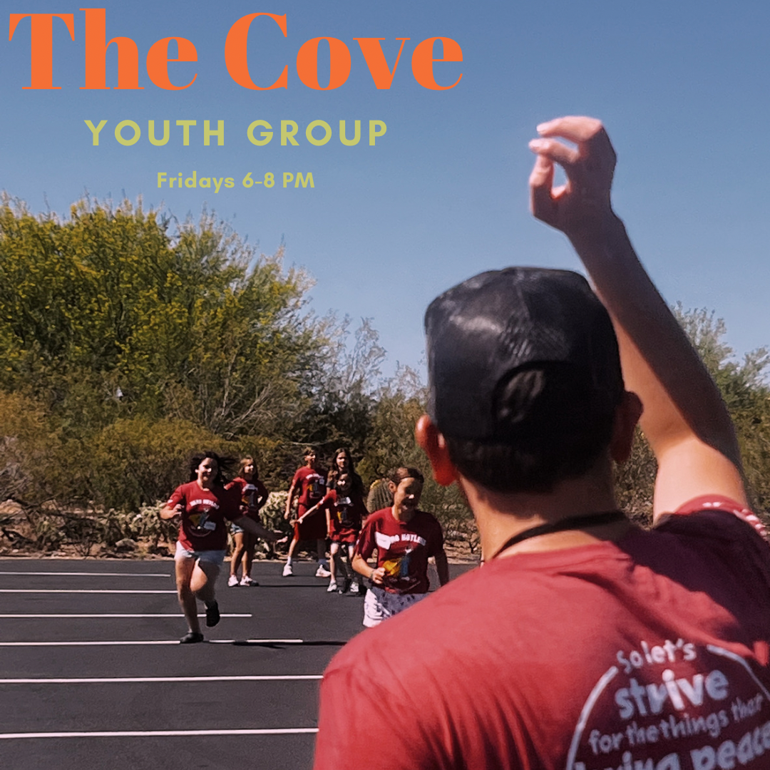
For the Tucson church, I created a vibrant, modern color palette that aligned with the existing brand while incorporating brighter, energetic tones to appeal to younger audiences. The visuals were supported by dynamic graphics and content tailored to their podcast and college outreach.
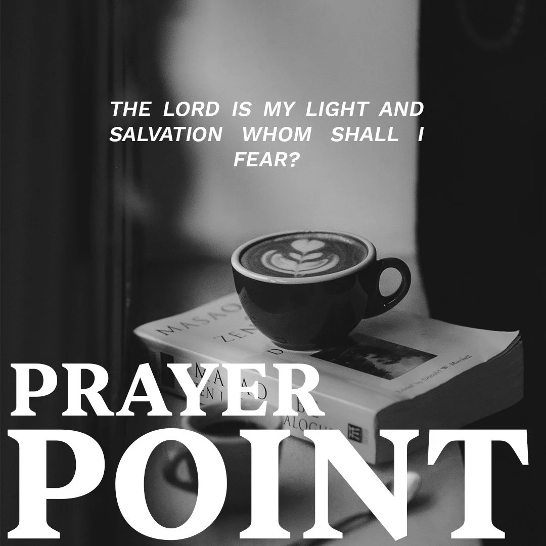
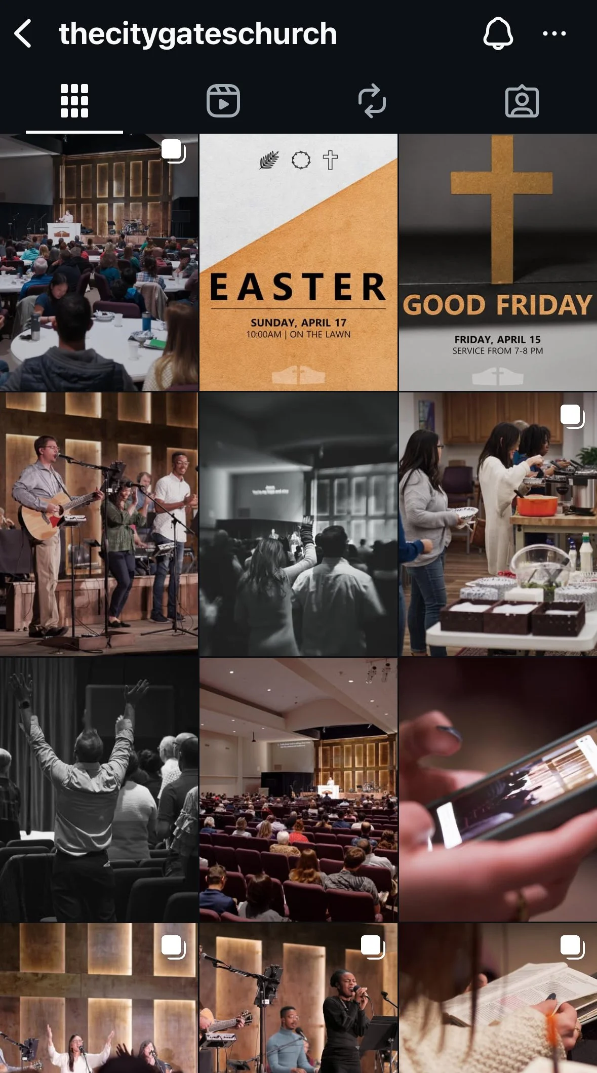
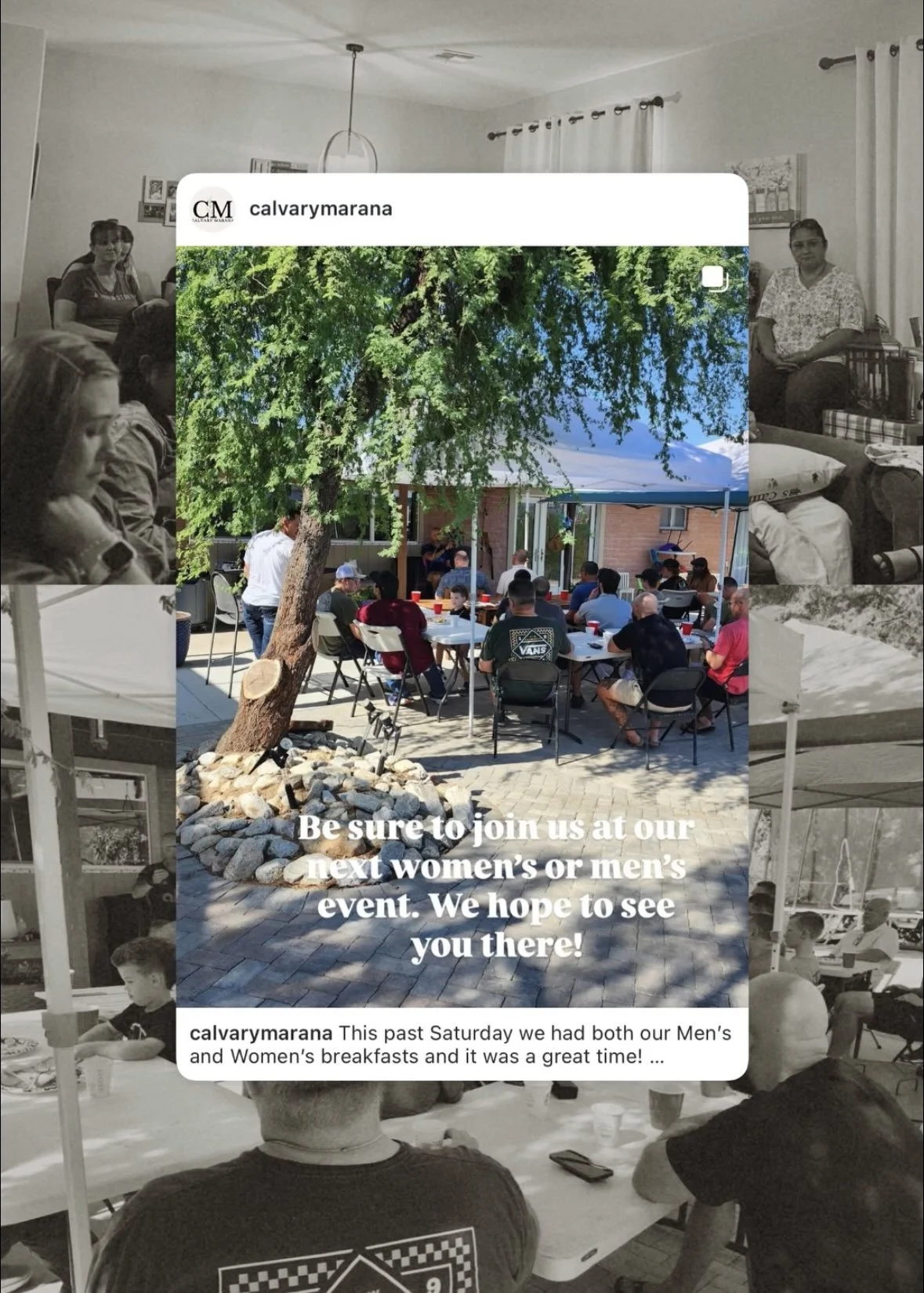
For the East Coast church, I took a minimalist design approach with a neutral color palette, cleaner layouts, and a stronger emphasis on photography. To align with the church's focus on authenticity and community, I used real-life imagery of members and events instead of heavy graphic elements.
Outcome
Both rebrands helped improve visual consistency and audience engagement across platforms. The Tucson church saw increased interaction on posts related to their podcast and college group, while the East Coast church experienced higher engagement with photo-based posts featuring their congregation. These results confirmed the importance of tailoring design strategy to community identity and audience expectations.